Boost Energy
Self initiated refresh
March 2019 - August 2019
The first step I took was to conduct a visual study of Boosts competitors to identify industry trends on how color, typography and layout impacts complex UI systems.
Information architecture
The IA was relatively simple but I felt it was wort formally documenting this. I built a site map to help inform my decision making when considering components and overlapping elements.
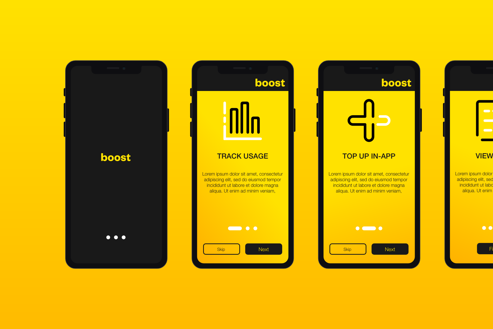
Wireframes
I used rapid wireframing to transfer the information from the existing app into an easy to understand and highly editable low-fidelity prototype, no colors meant the focus was on the information hierarchy and legibility.